Оранжевые акценты

Sorry, this entry is only available in RU.

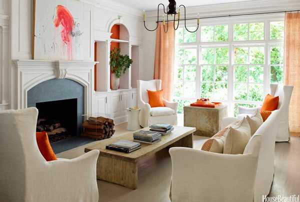
Дизайнер Kay Douglass за основу в этом светлом доме в Атланте взял нейтральную пастельную палитру. На этом фоне яркие оранжевые детали во всех комнатах смотрятся очень свежо, создавая ощущение вечного лета и тепла. К тому же, это любимый цвет дизайнера – цвет, который, по его мнению, приносит радость и жизнь. С ним сложно не согласиться, особенно глядя на этот замечательный интерьер.

Источник: House Beautiful

About Author:
Serge Pufik is the founder and mastermind of pufikhomes.com blog. Sergiy is an economist by profession, he worked in real estate and from childhood was fond of interior magazines. Together with his wife Anna they run design studio PH Studio, managing projects in Ukraine and far beyond.
Like this post? Please share to your friends:

See also

Leave a Reply

:) :D :( :o 8O :? 8) :lol: :x :P :oops: :cry: :evil: :twisted: :roll: :wink: :!: :?: :idea: :arrow: :| :mrgreen:

This site uses Akismet to reduce spam. Learn how your comment data is processed.