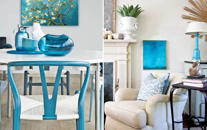
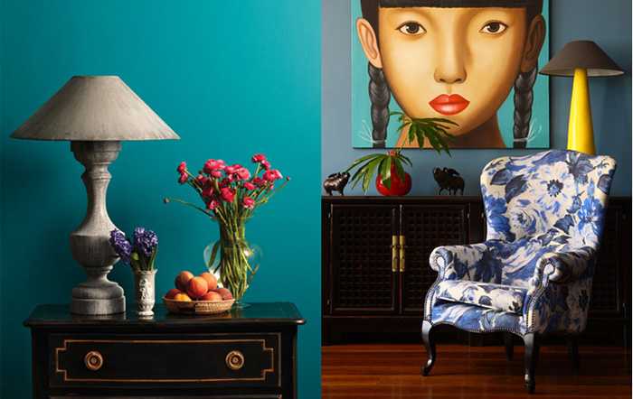
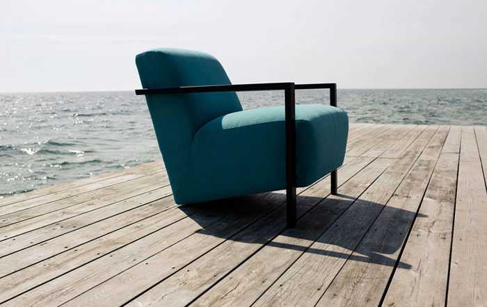
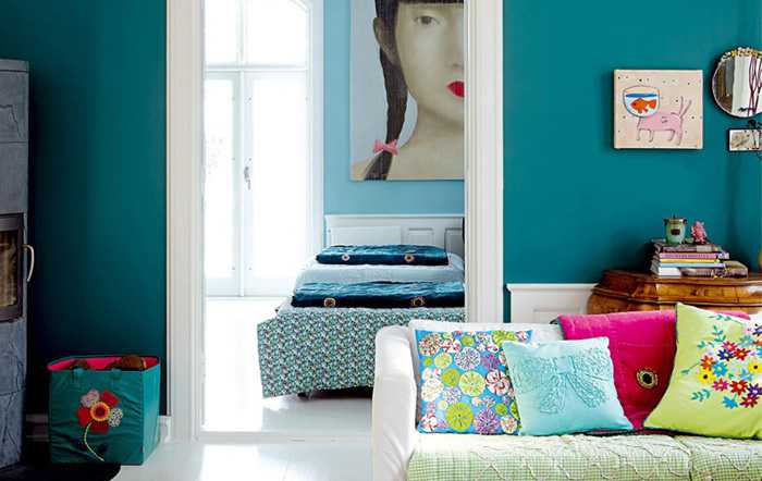
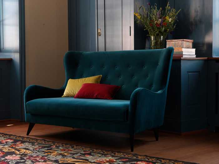
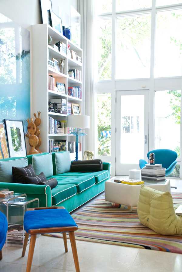
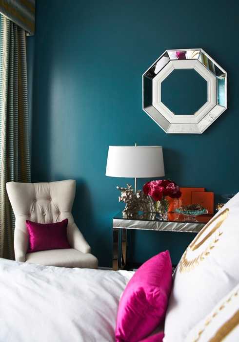
They say that the turquoise color in design is chosen by unusual people who love everything new and positive, who do not perceive bad taste and disharmony. Real aesthetes who know a lot about beauty. Being a complex color consisting of blue and green, turquoise is very dependent on lighting. In warm light, the turquoise hue will look softer and more sunny, in cold lighting a blue will appear, which will make the interior fresh and austere.


Очень красиво! Березовый цвет действительно отлично вписался бы в интерьер любой квартиры. Однако как по мне и по многим представленным фотографиям в данной статье данный цвет отлично сочетается с элементами дерева.