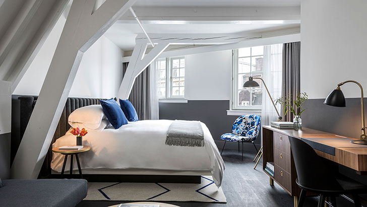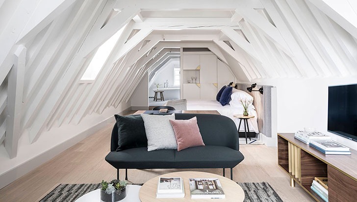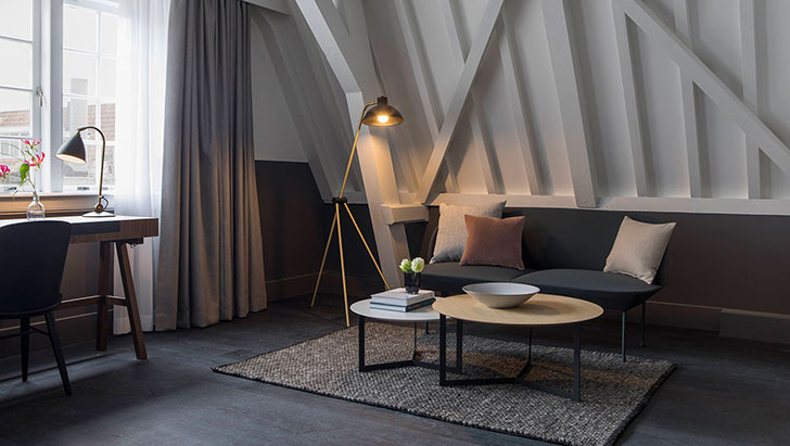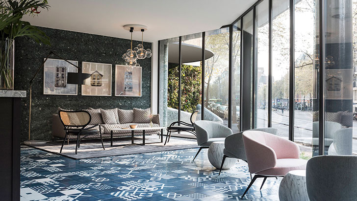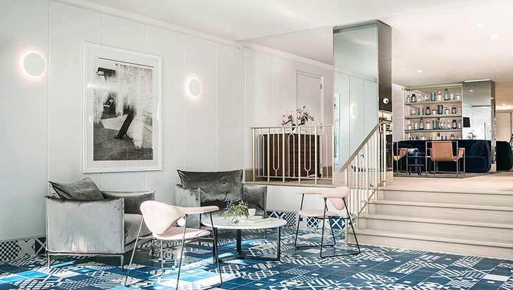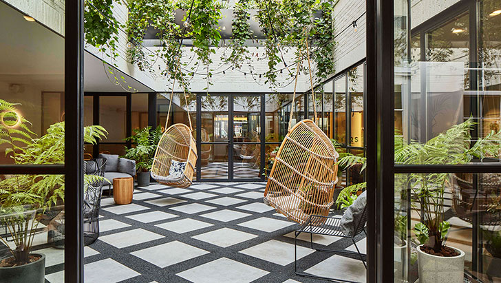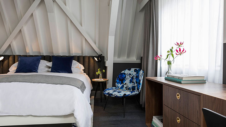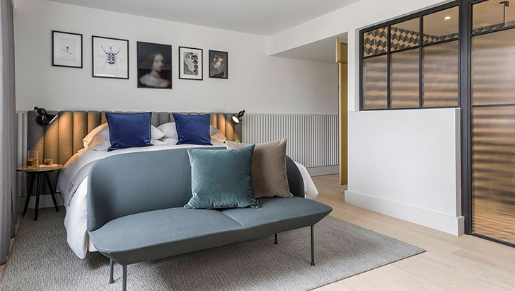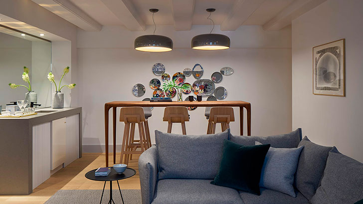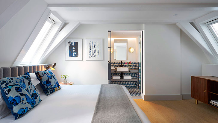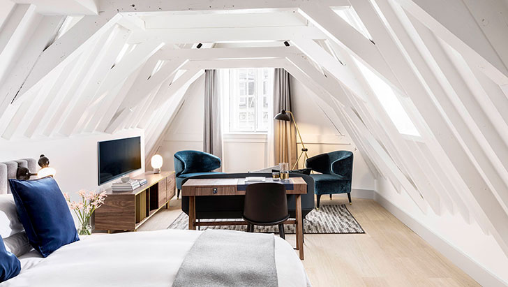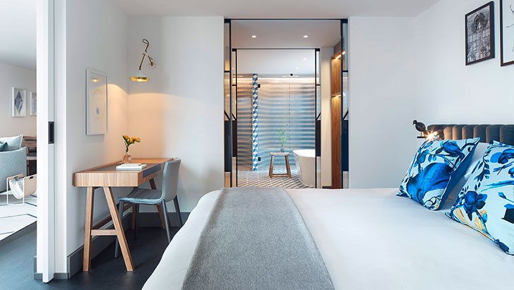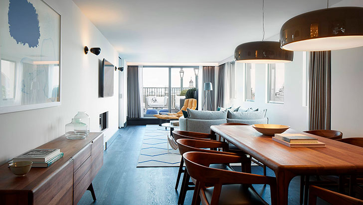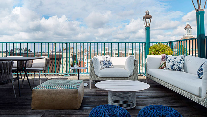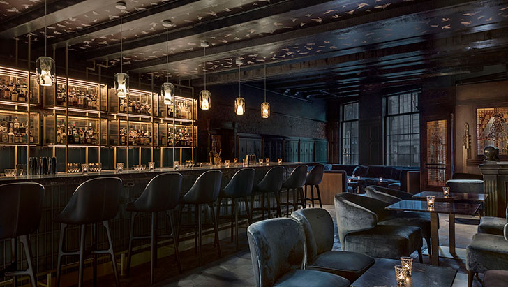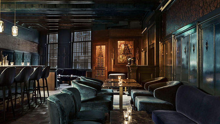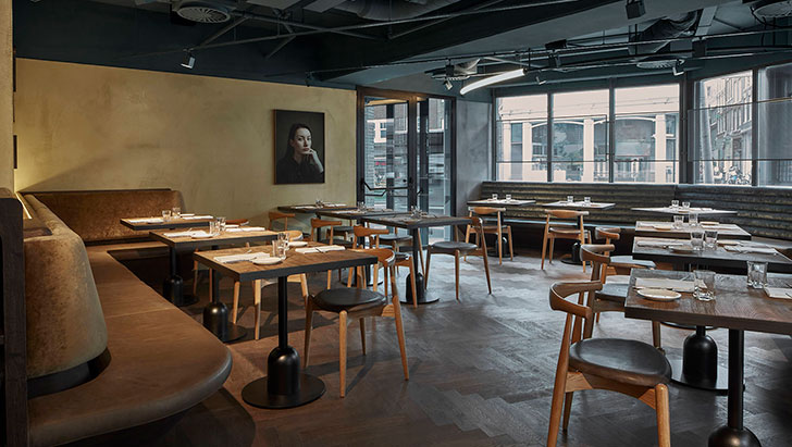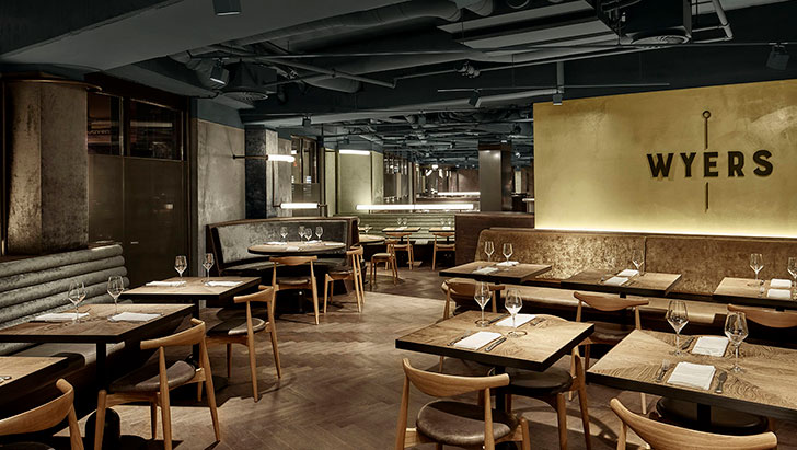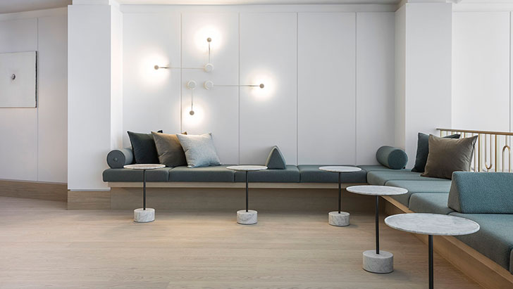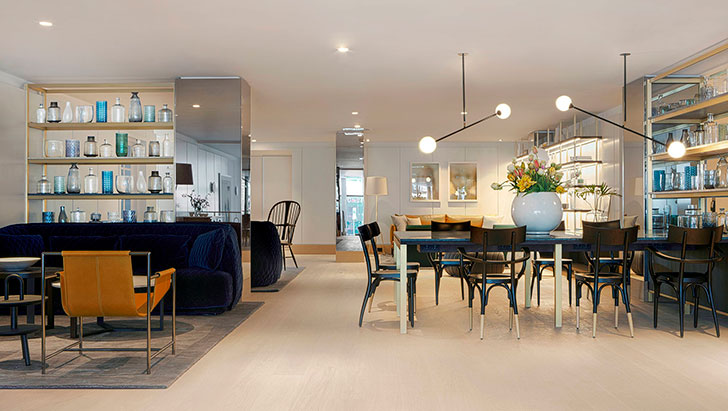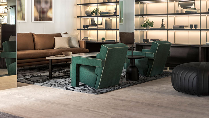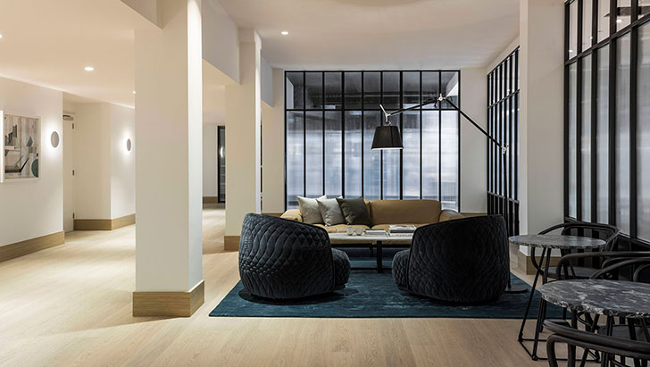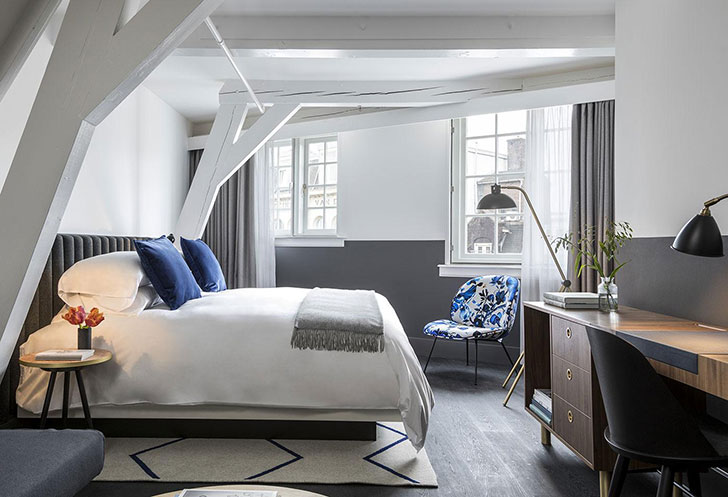
Accents in design are as much important as general concept and color scheme. At Kimpton de Witt hotel in Amsterdam, the main highlights of the design are blue accents and floral prints. They perfectly compliment the cool gray-white color scheme and make the interiors special. One of the main roles is also given to geometry which is seen in the planning and decorative solutions. Especially we love the bar that is both in mood and color noticeably different from the whole hotel – it is a little gloomy and mysterious, with point lighting and black walls. Such an interesting and stylish project!