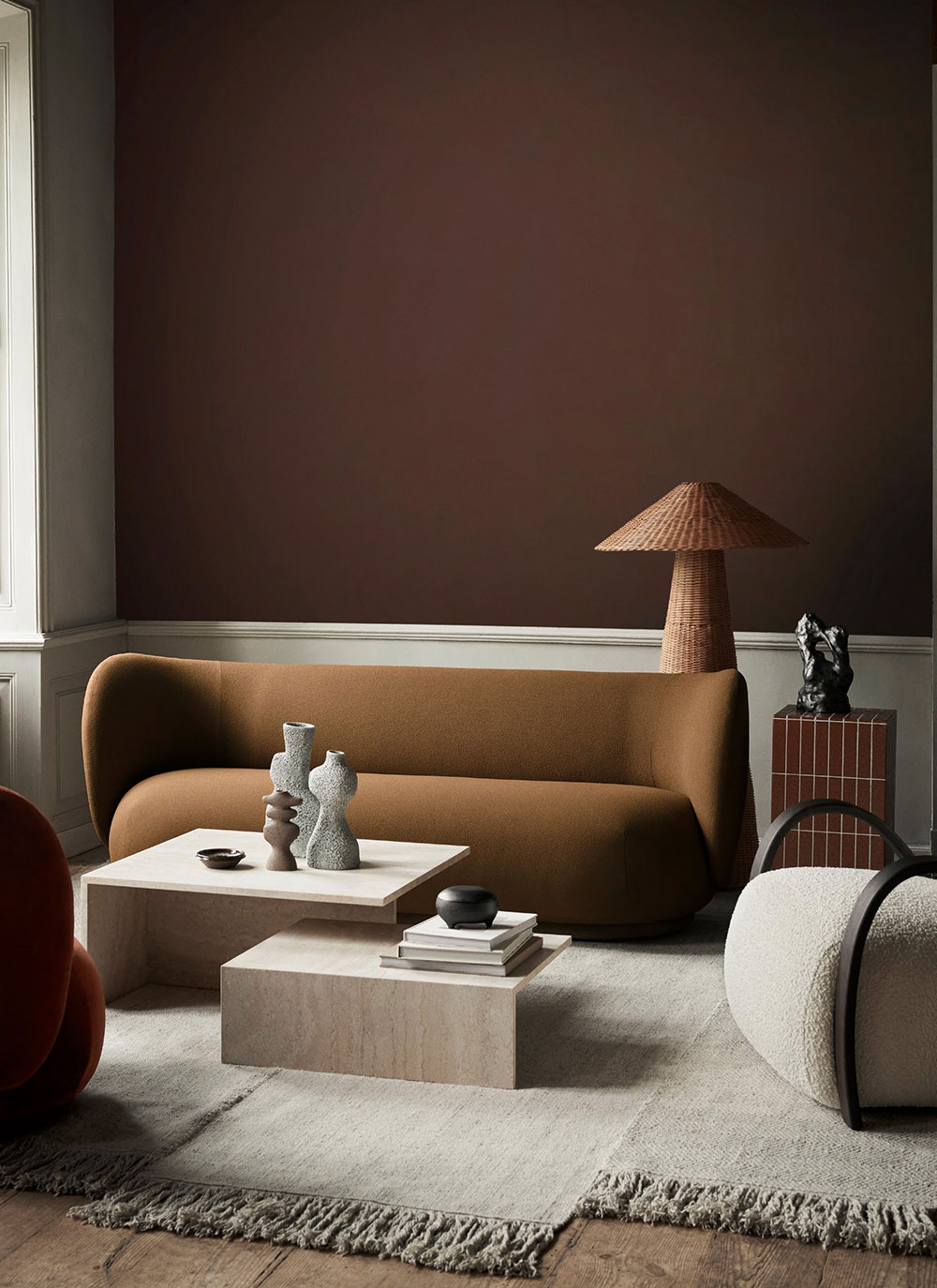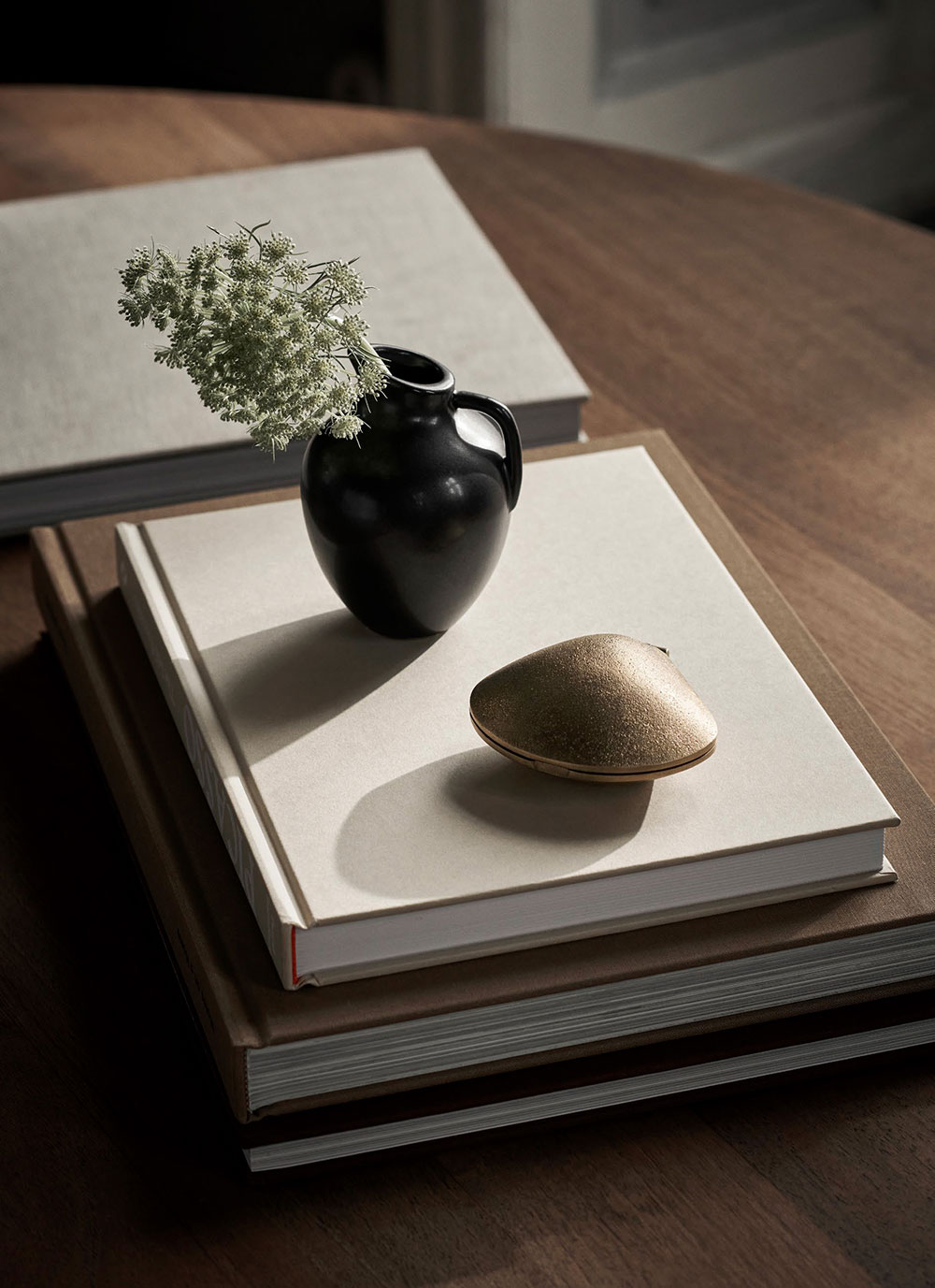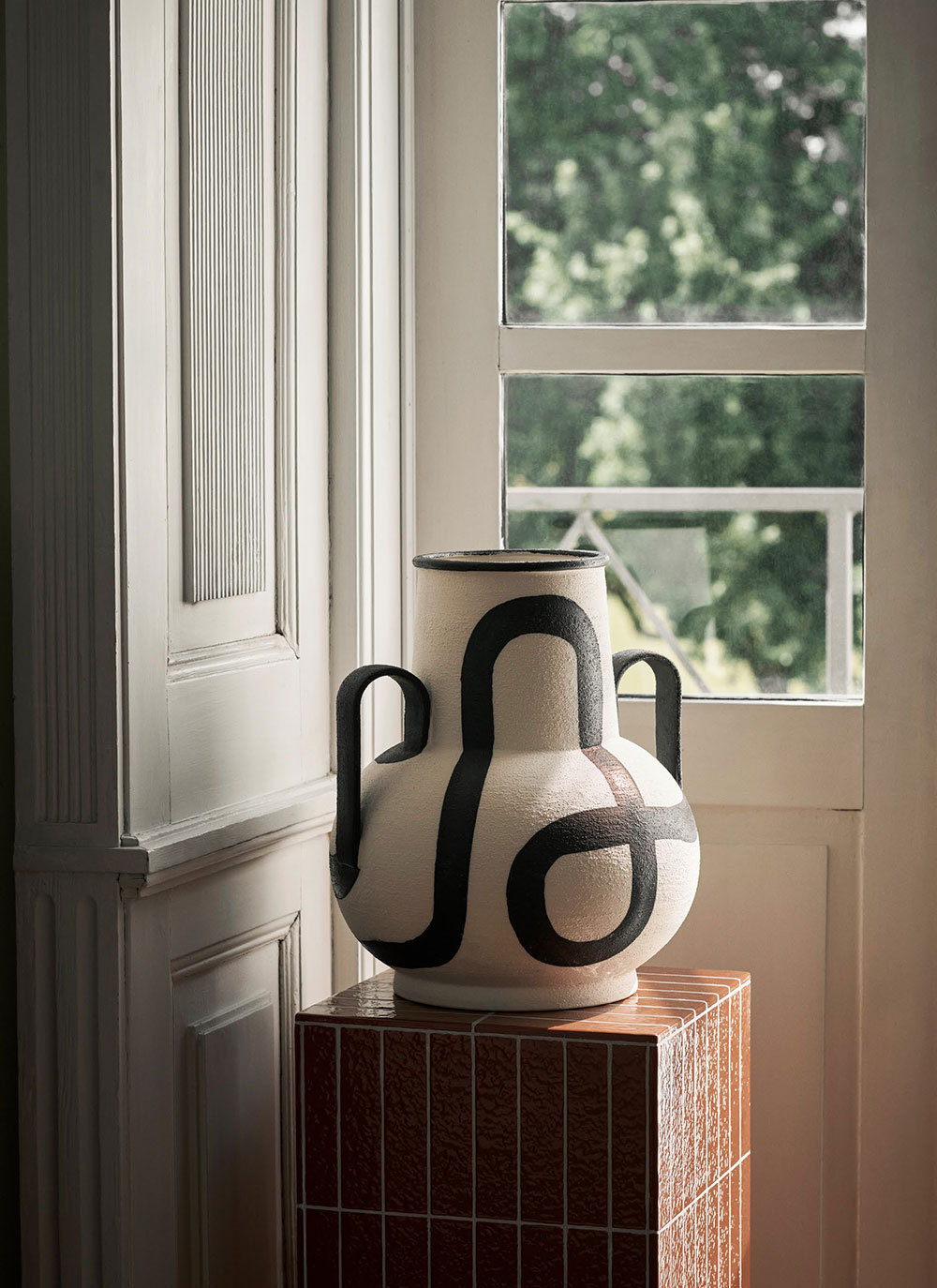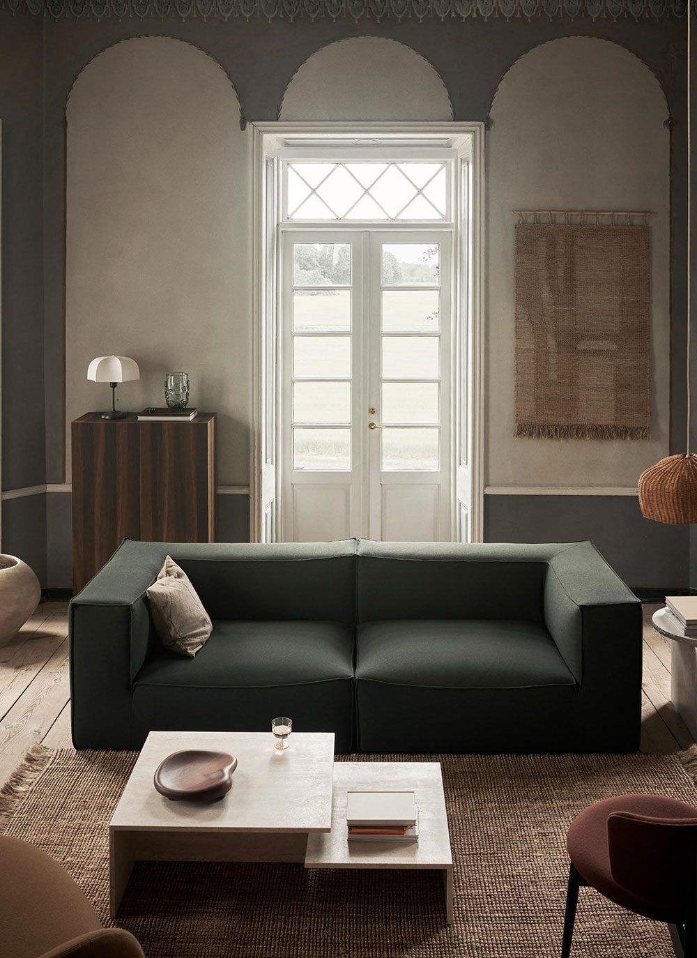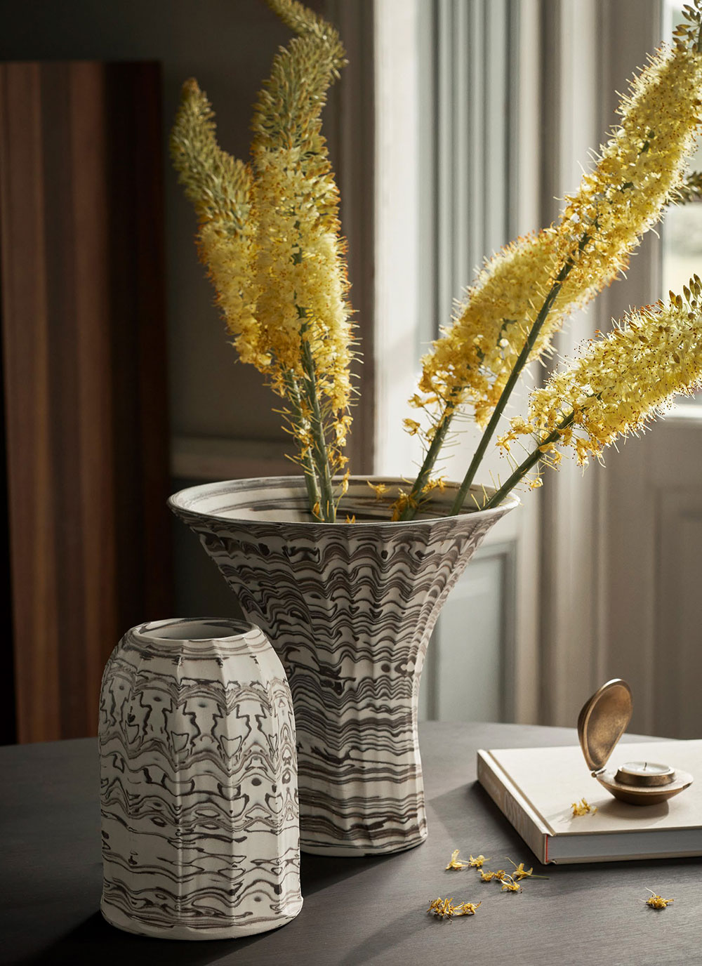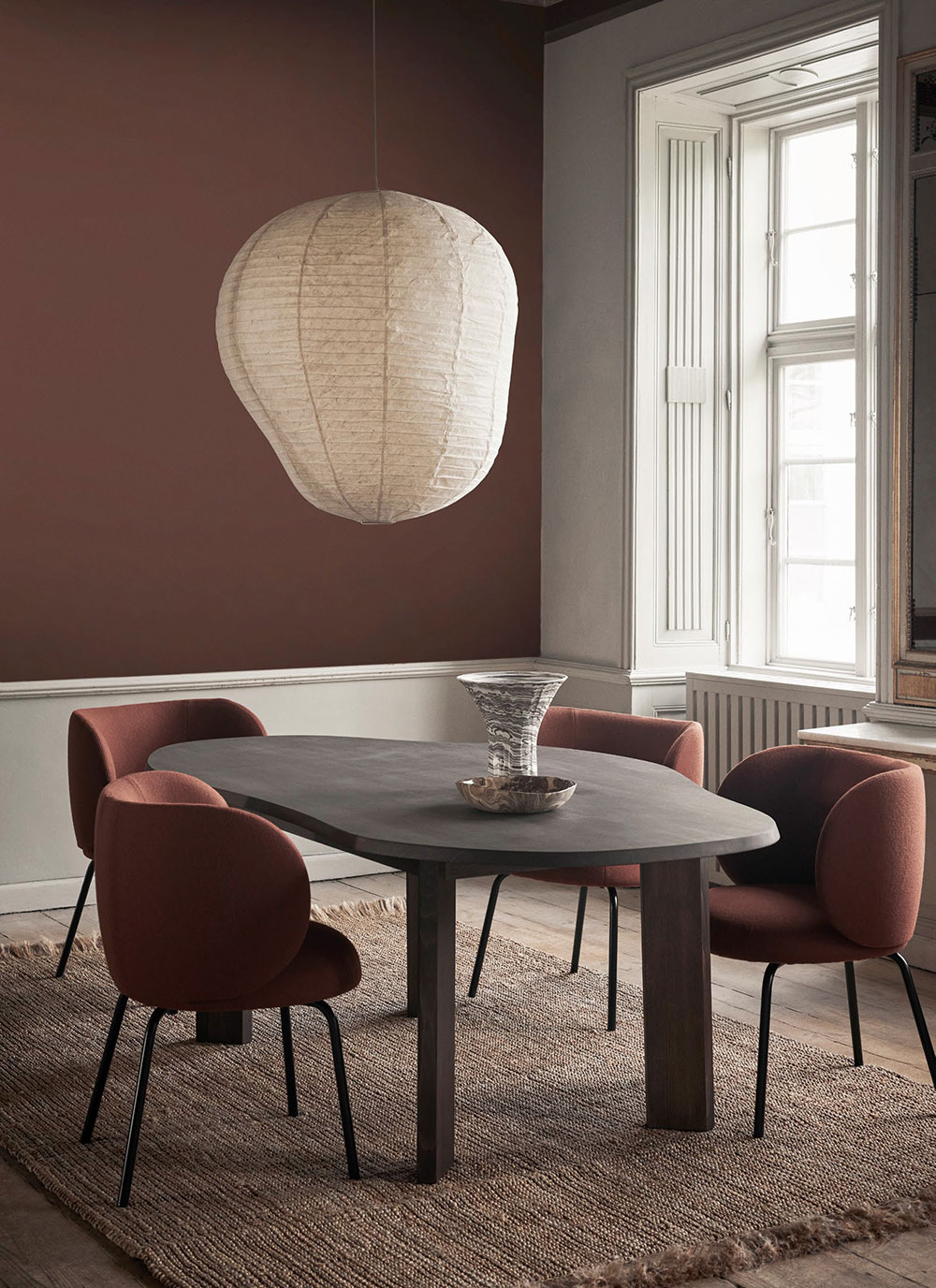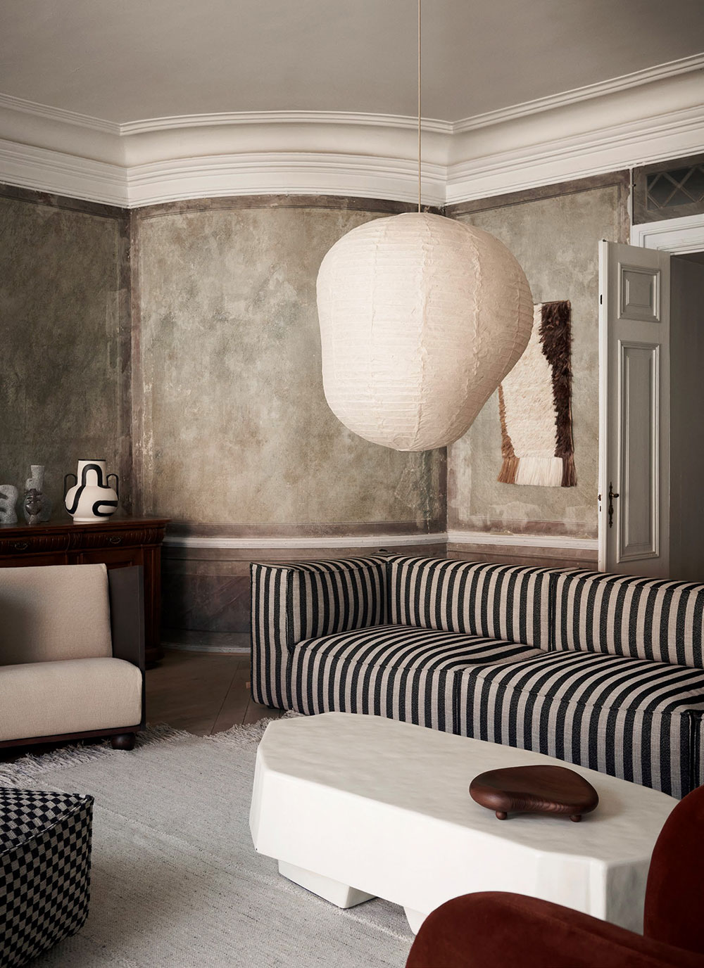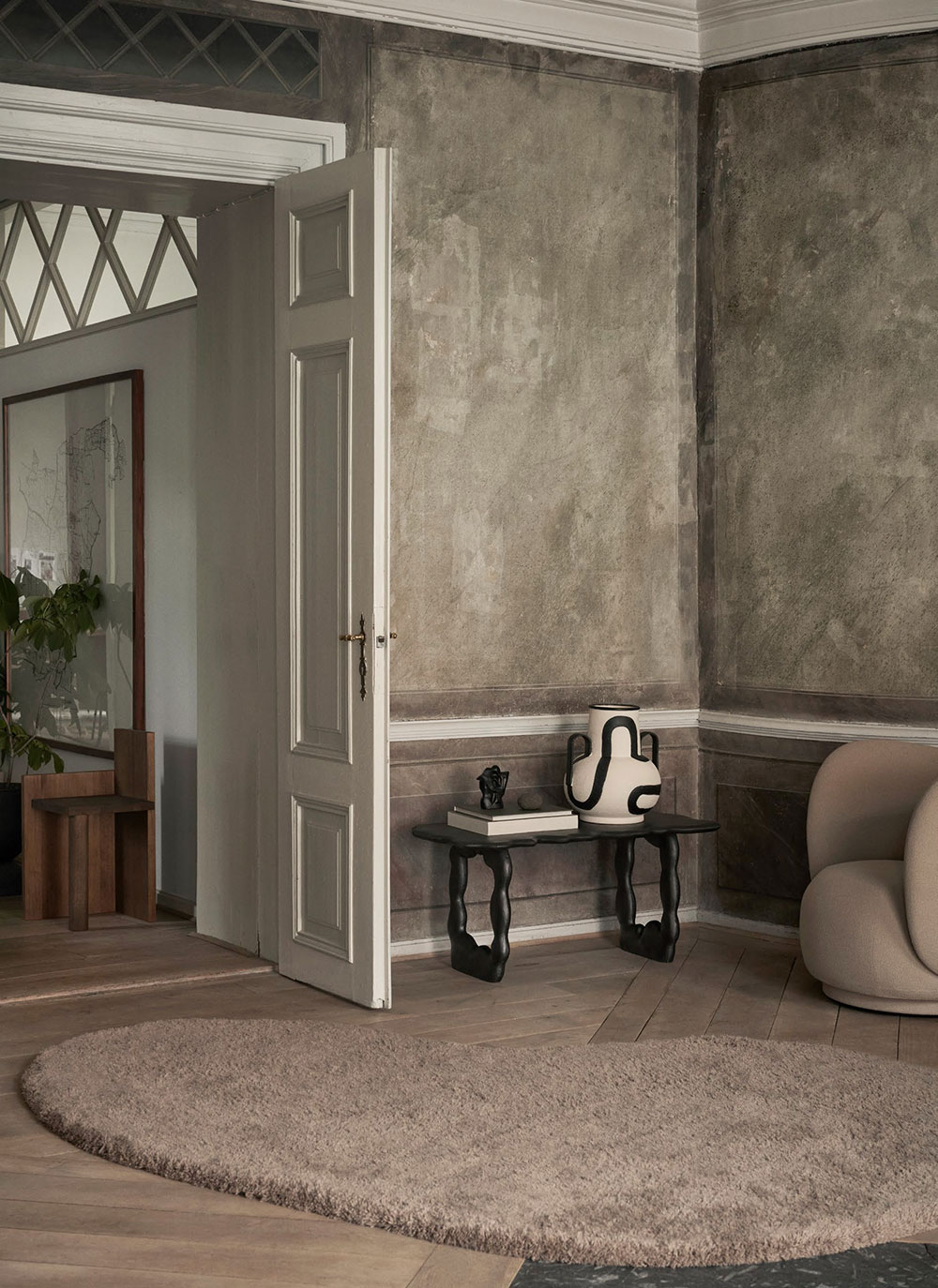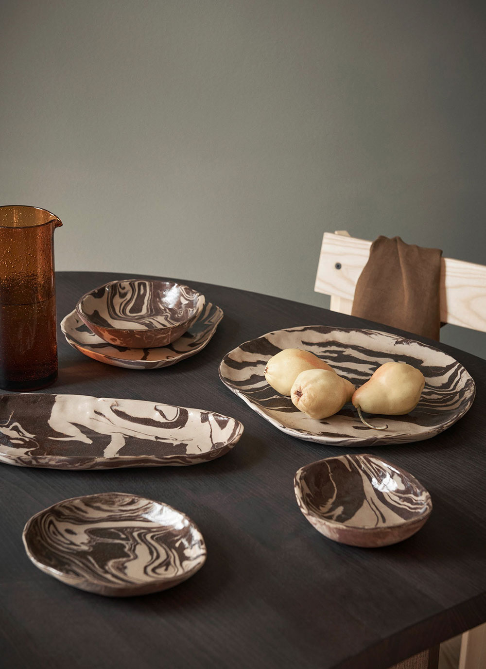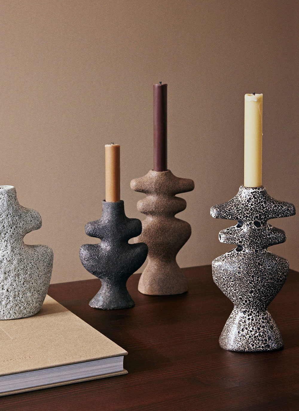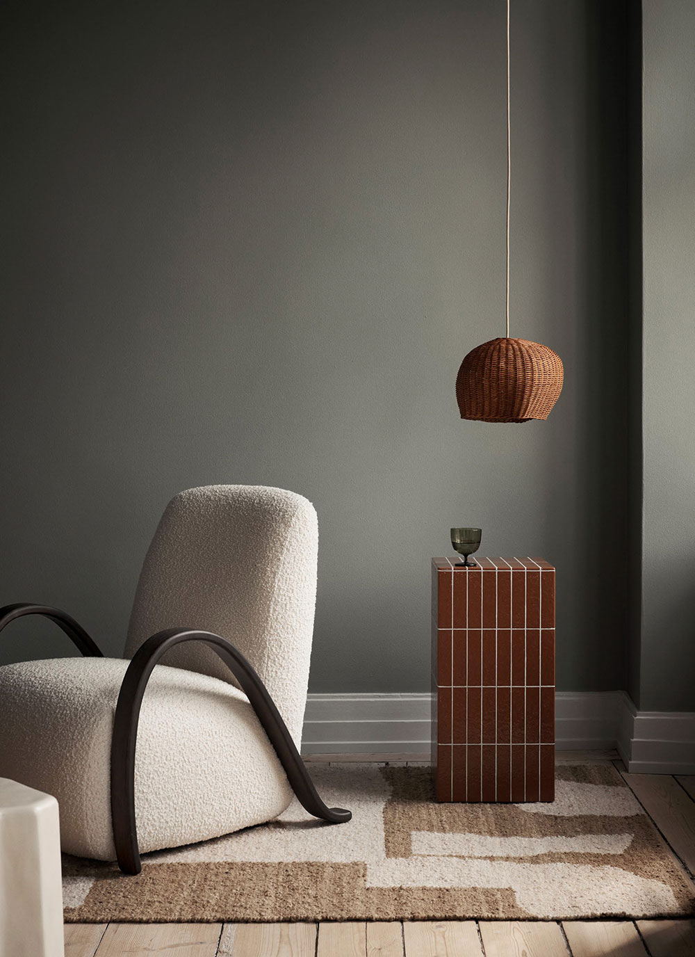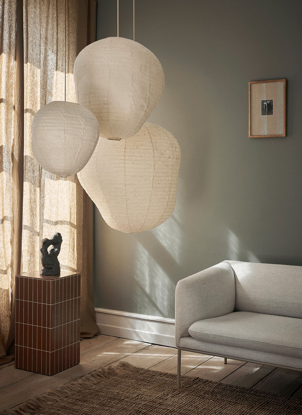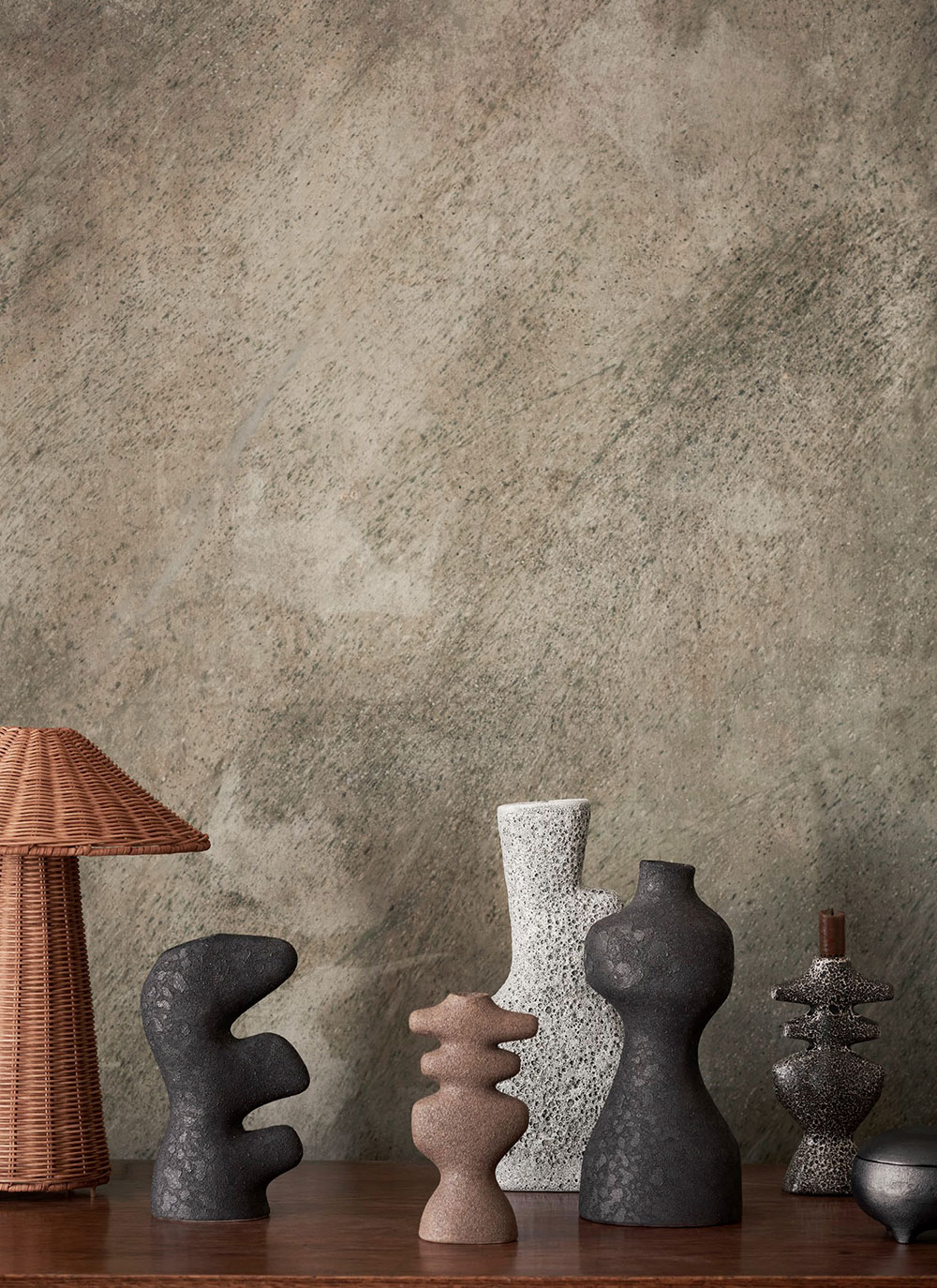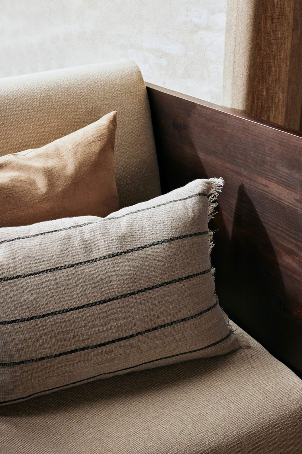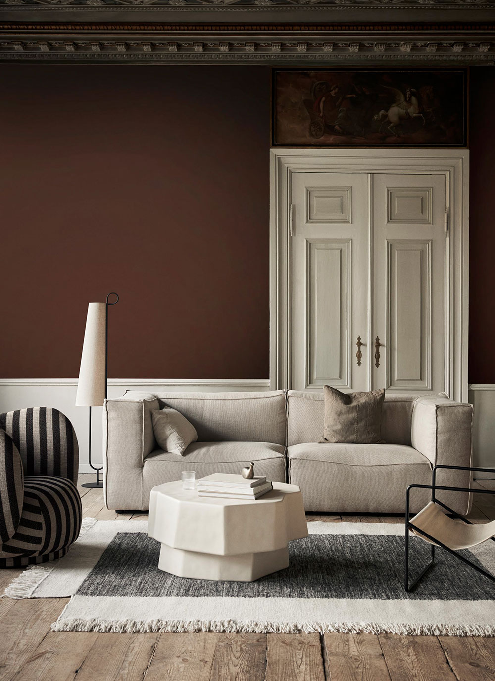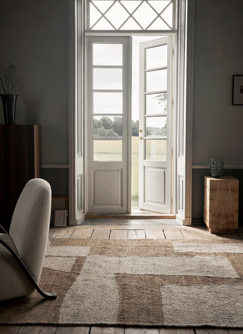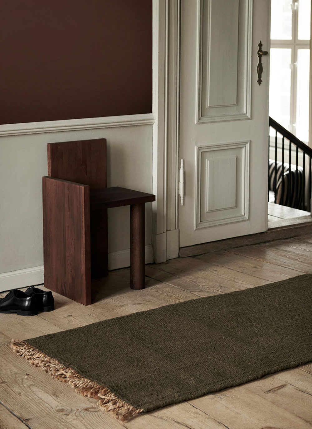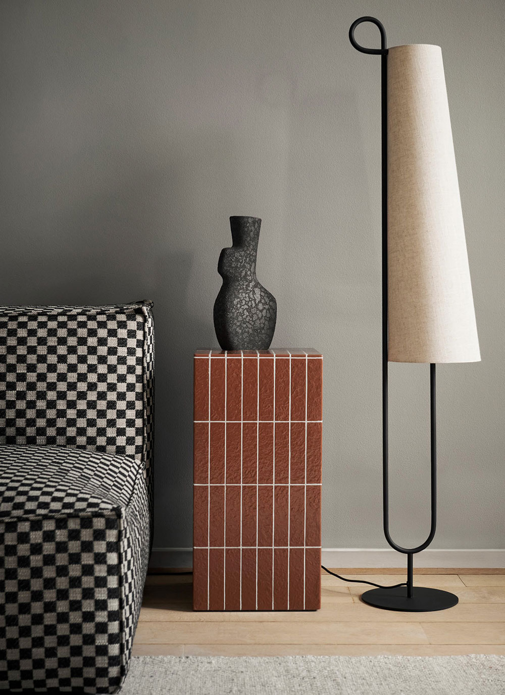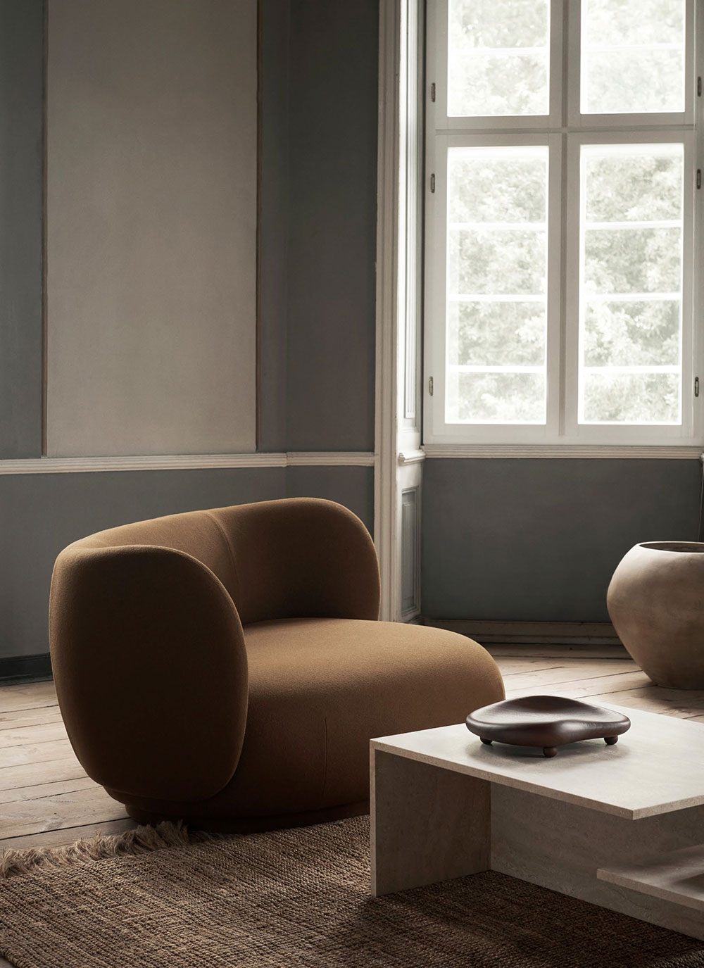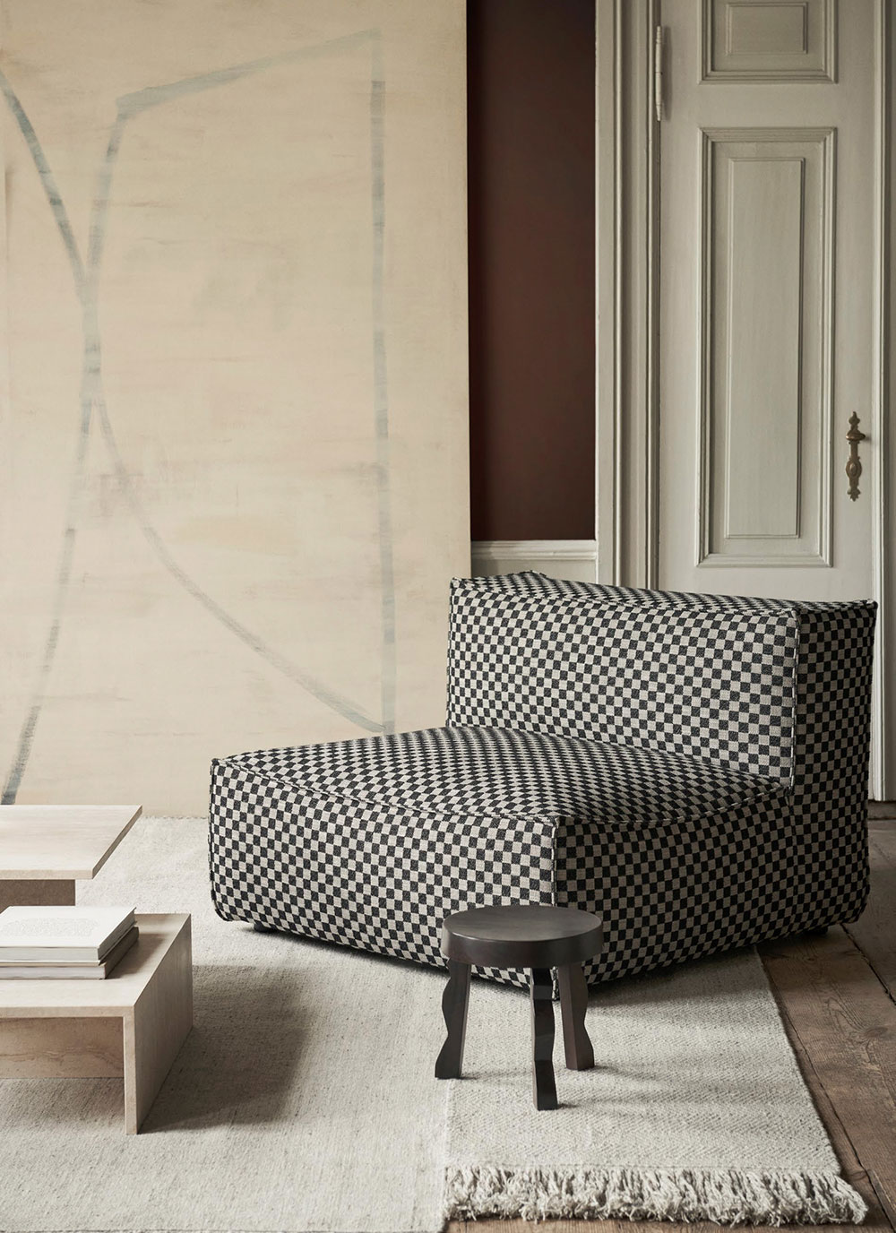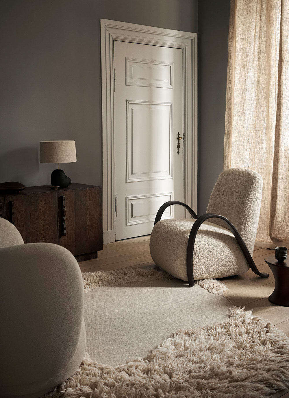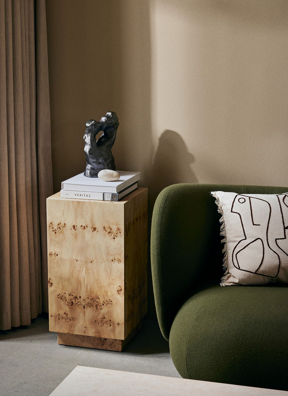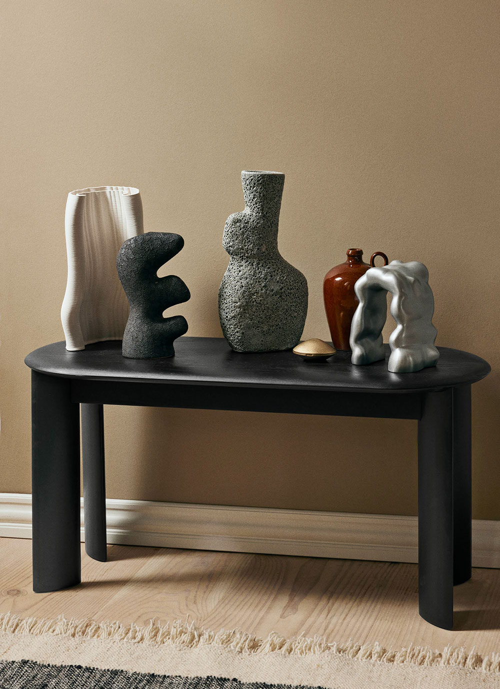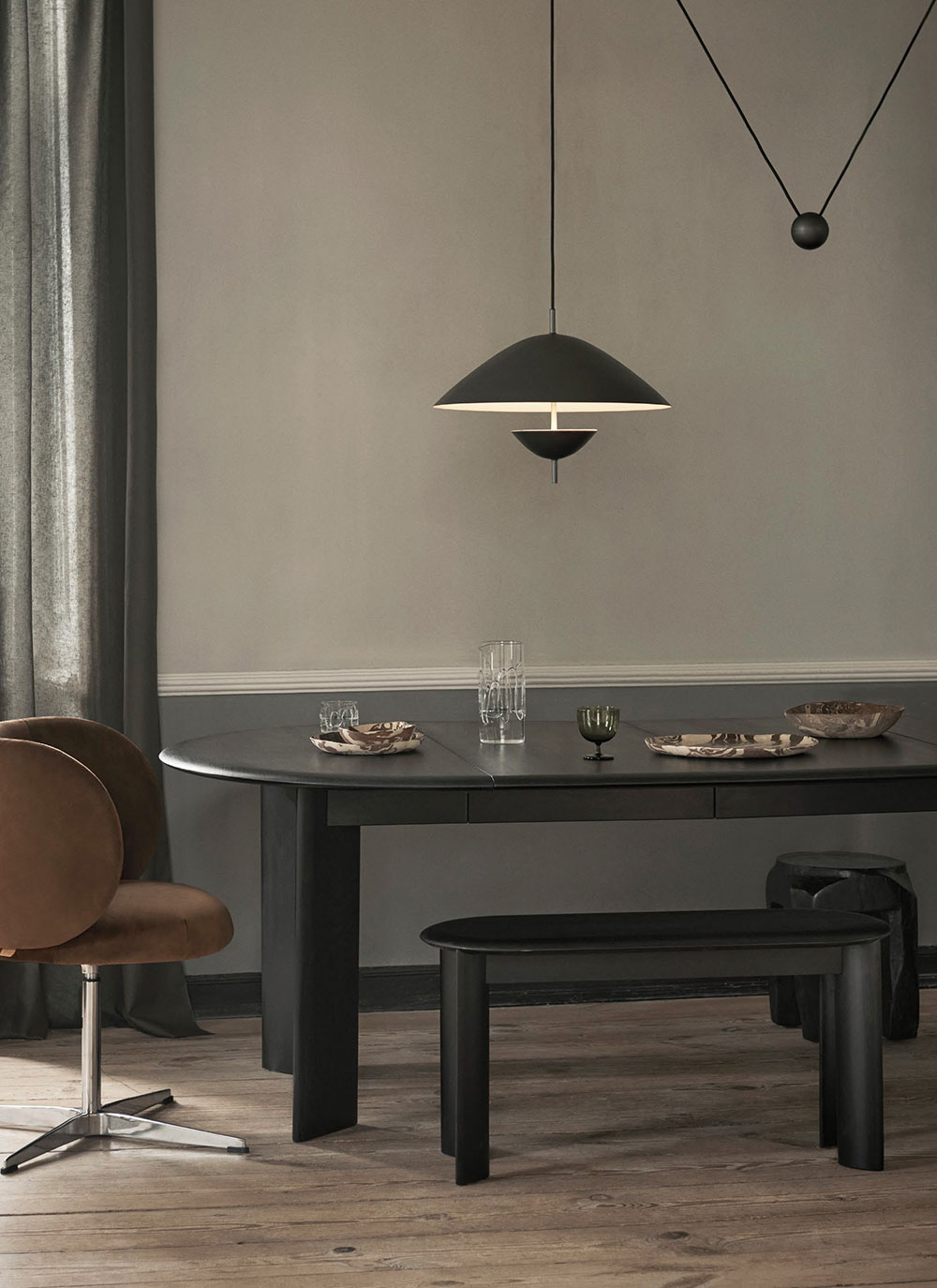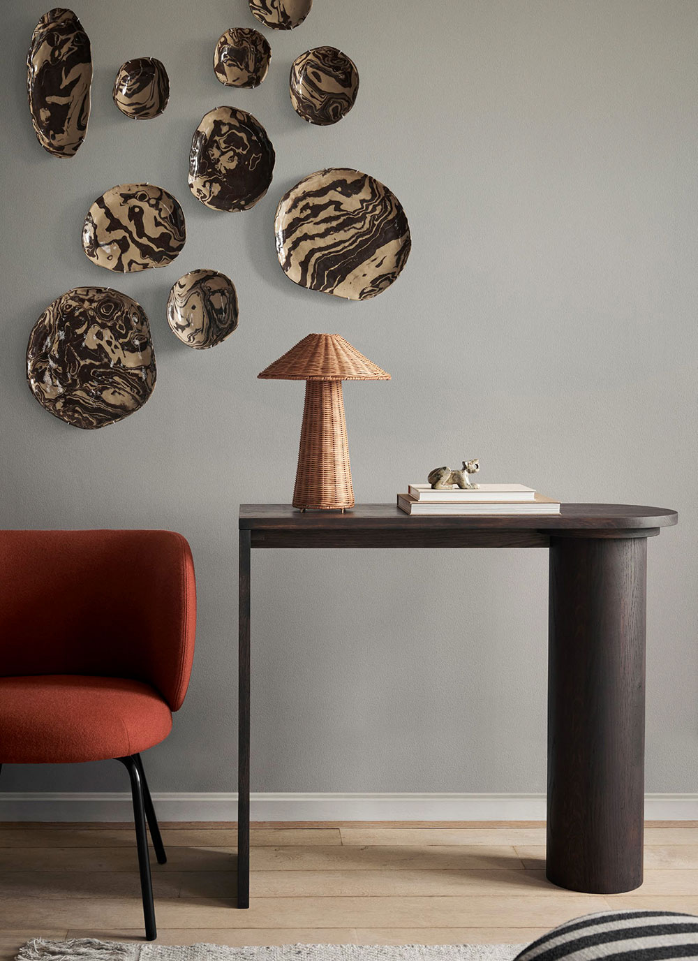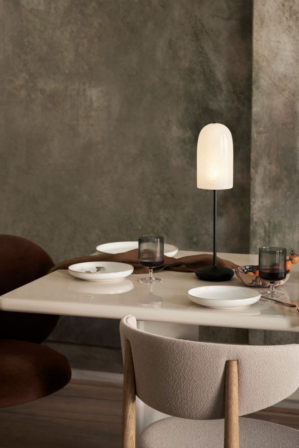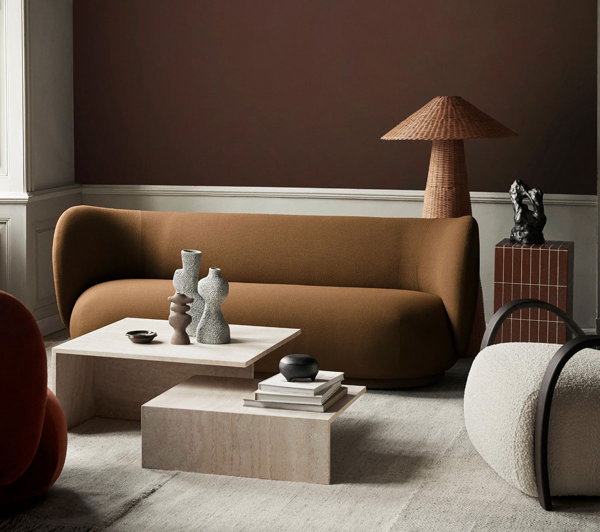
Our favourite Danish brand Ferm Living gave the name Choreography of Contrasts’ to its new collection of home goods for a reason. The designers decided to show the dialogue between opposites and reveal the beauty of mixing practicality and style, restraint and fantasy. Bizarre shapes of vases and candlesticks against the backdrop of classic walls, simple natural materials in an elegant design, light surfaces next to bold dark accents – photographs from the new catalog inspire to create and search for new bold solutions. Enjoy!