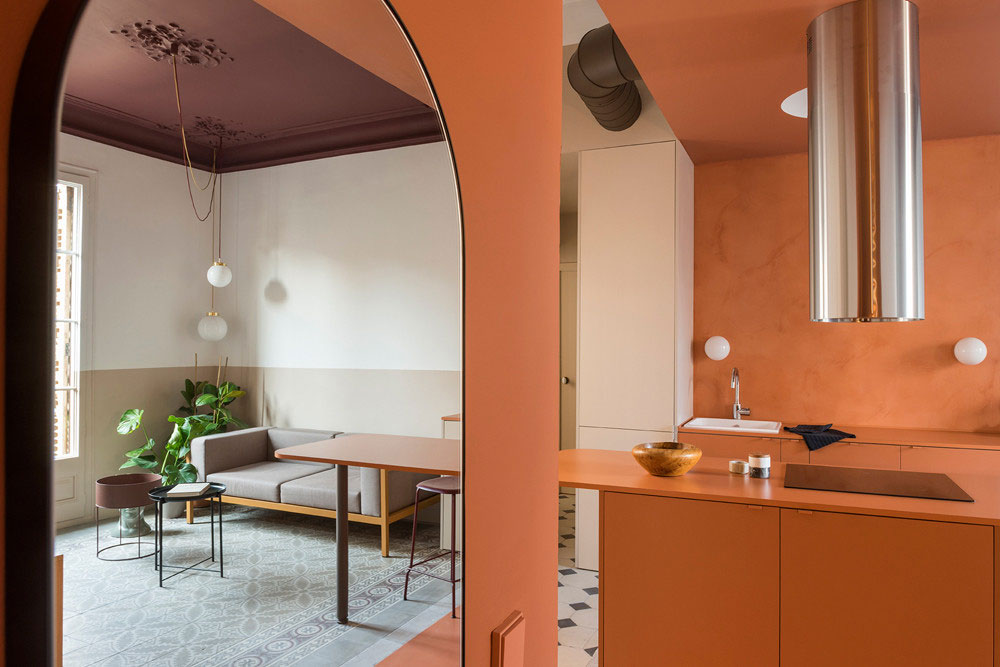
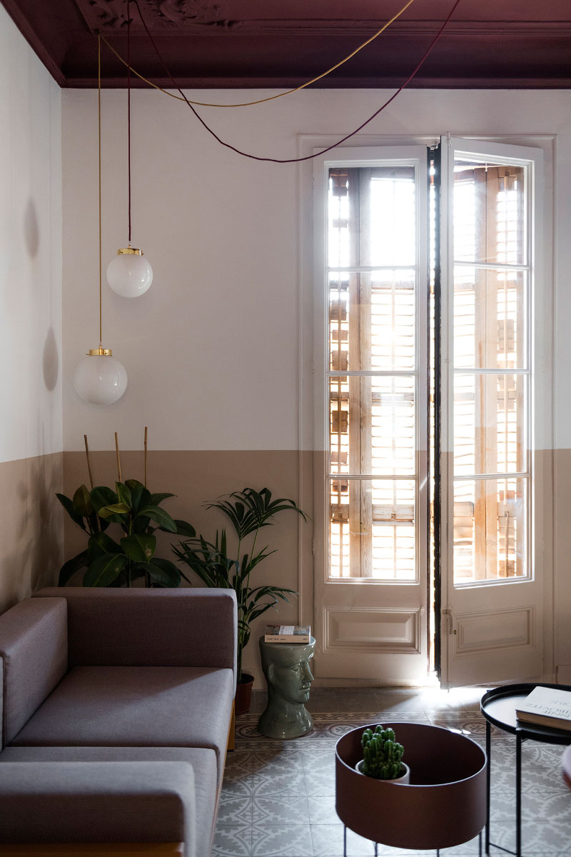
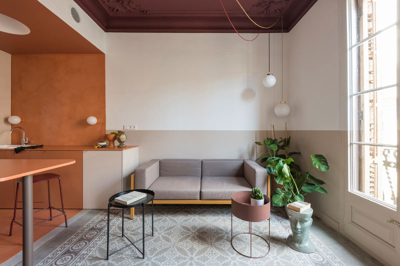
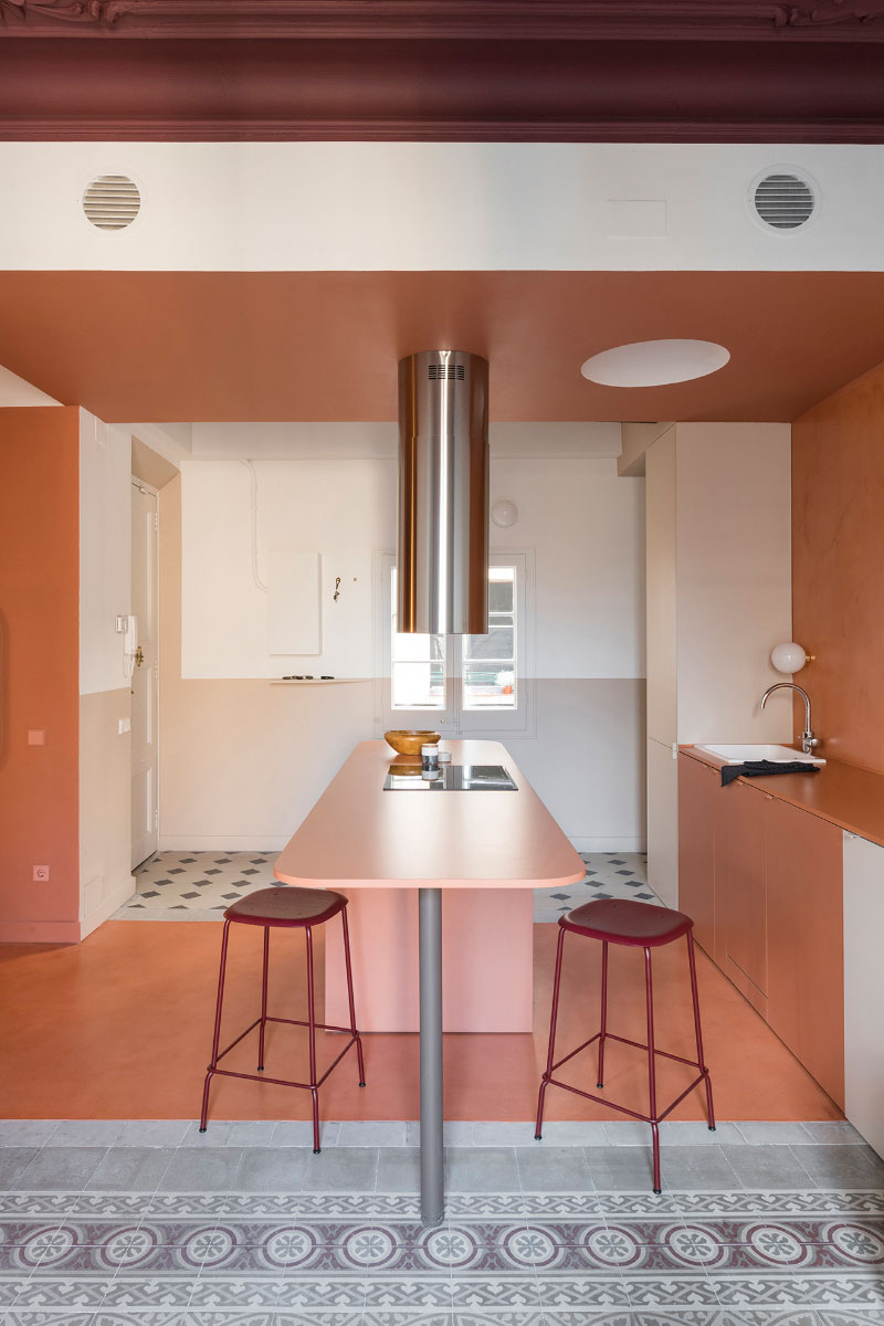
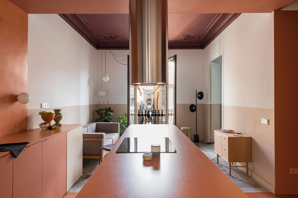
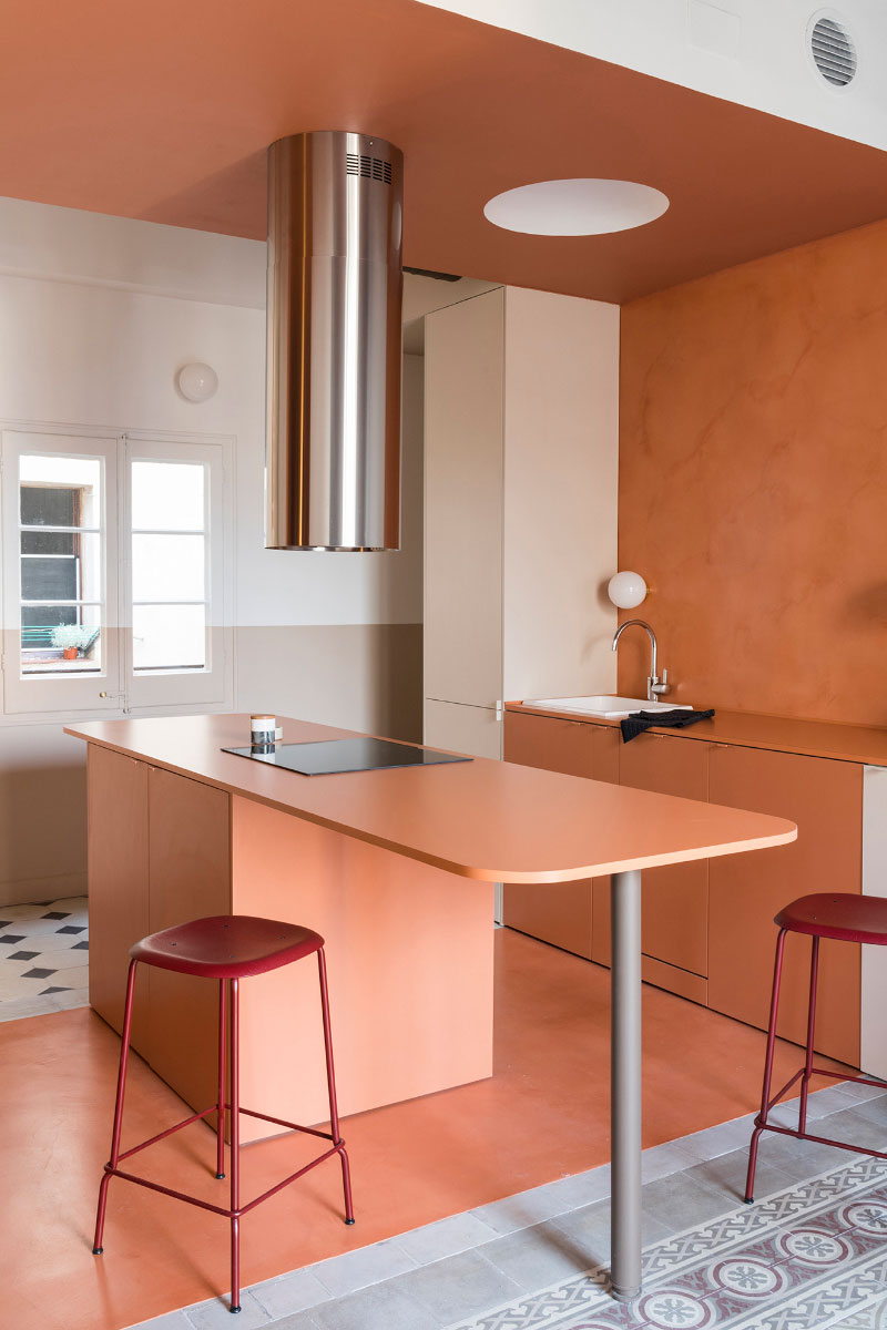
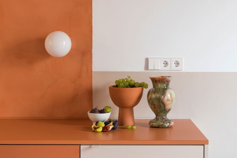
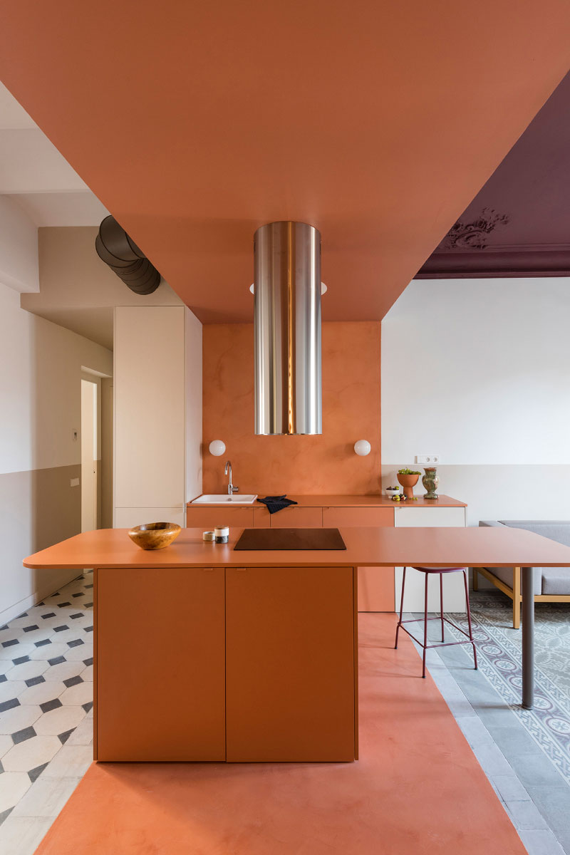
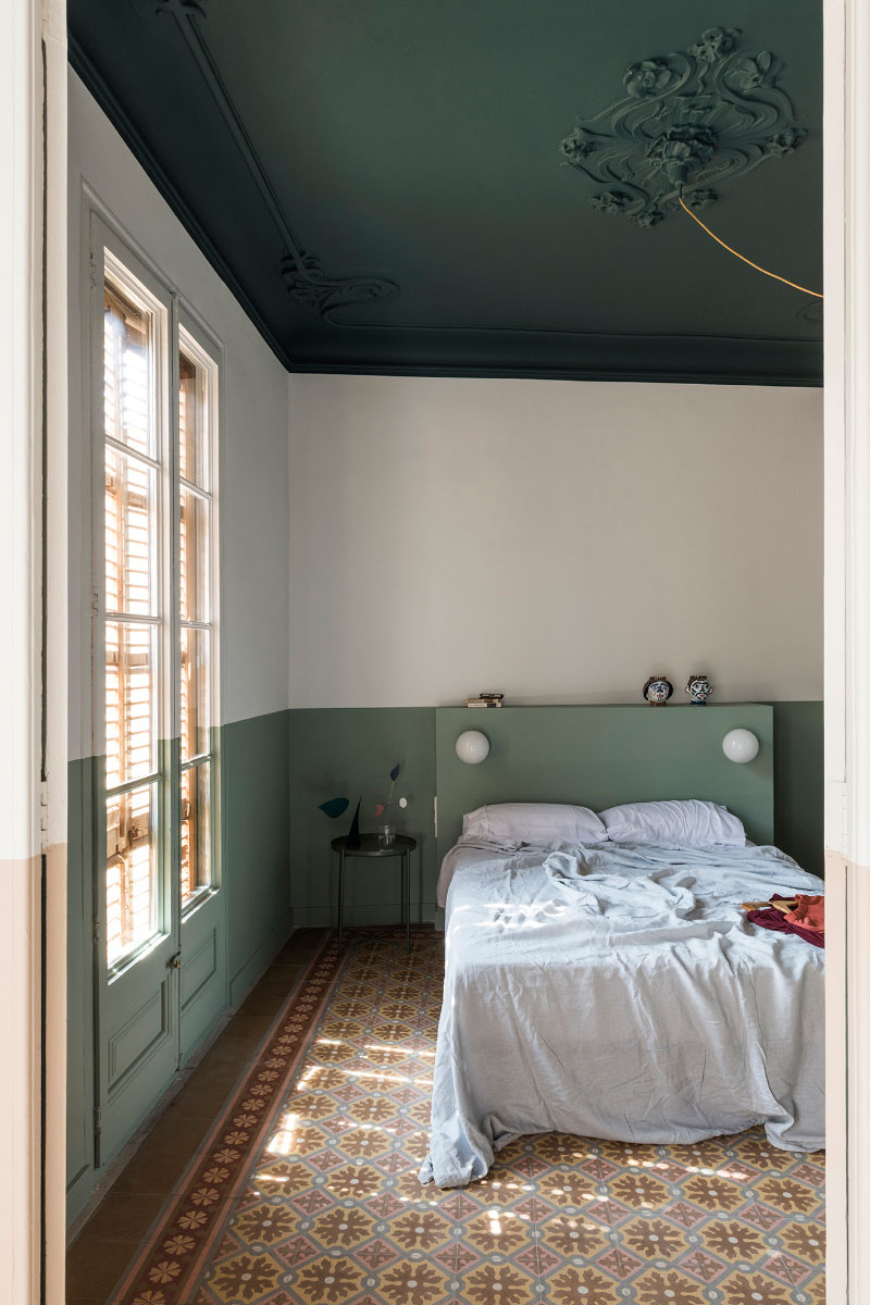
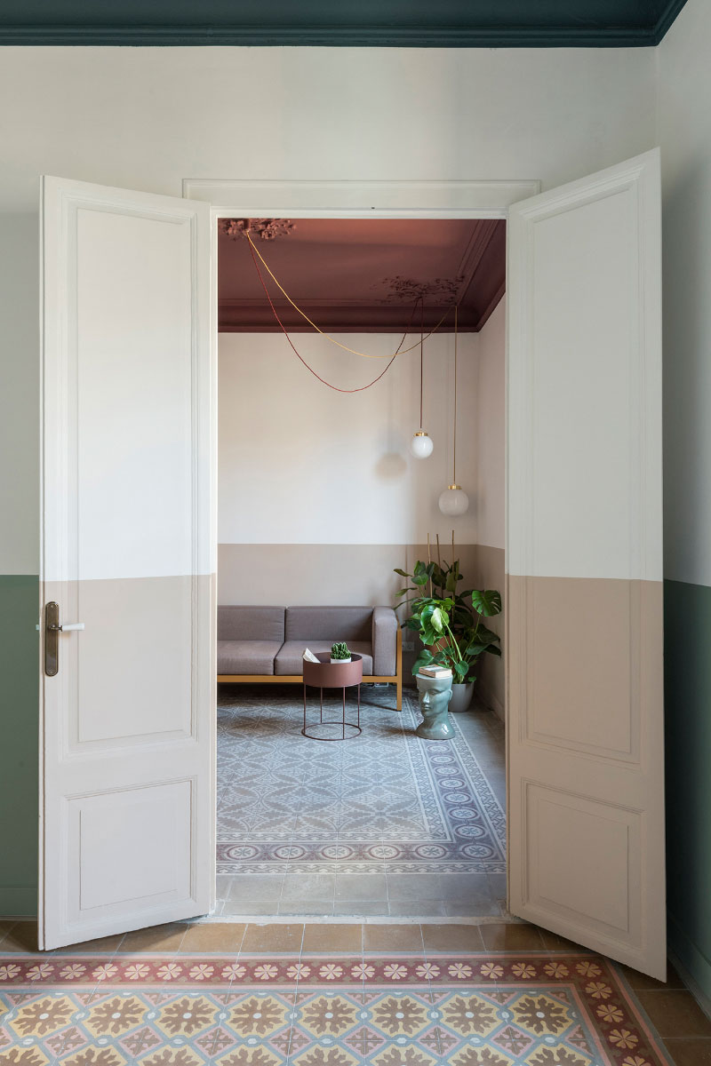
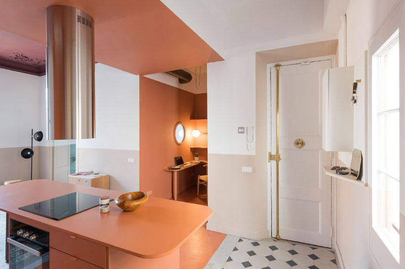
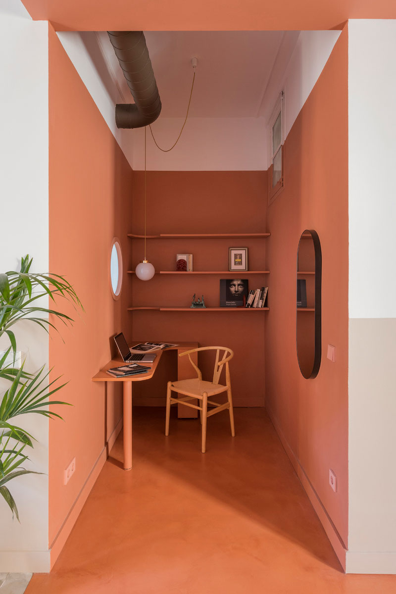
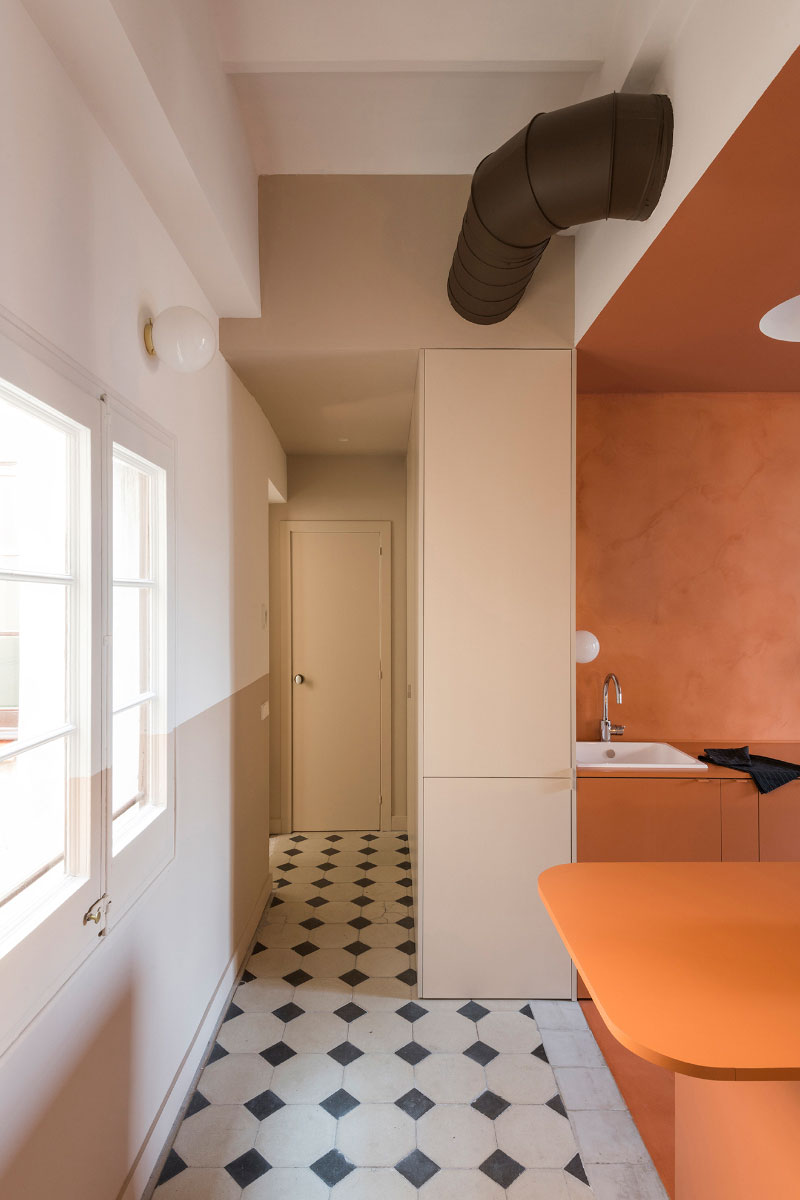
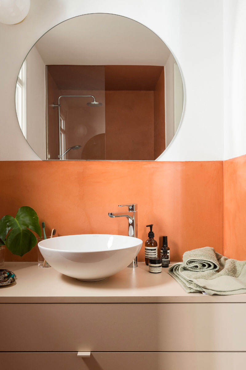
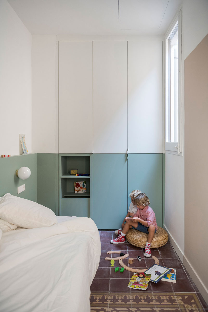
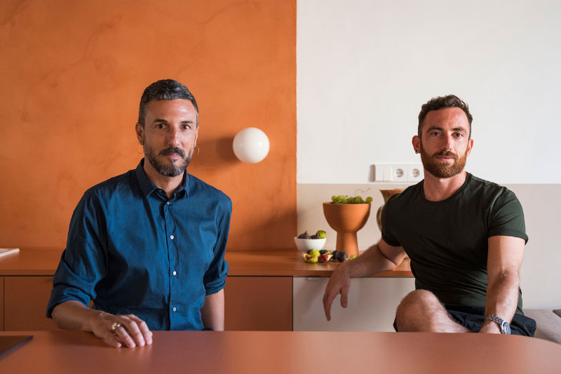
Architects Andrea Serboli and Matteo Colombo managed to revive a gloomy apartment in Barcelona with help of an interesting color palette. They used the technique of color zoning – devoting each room to its own shade. The kitchen turned out to be the brightest – the carrot tone flows from the ceiling to the kitchen countertop, and from there to the floor, and is supported by accessories in the same shade. The second part of the room is calmer, beige, but this is not counting the burgundy ceiling. The office corner is decorated in similar orange tones, which, by the way, perfectly helps to cheer up for solving problems. The bedroom is designed in green tones and is supported by tiles with ornaments. Such color zoning is rarely seen in apartments, but how do you like this solution?


Лично у меня эмоции от просмотра данного интерьера – “винегрет”. Уютом и не пахнет. Я бы лично в таком интерьере жить не смог.
В моем советском детстве именно так и красили стены во многих учреждениях: больницах, школах, поликлиниках… и в ванной комнате родительской квартиры тоже так было. Половина стены – светлая известка, а нижняя половина – краска, чтобы при случае помыть. Особенно ненавистно сочетание белый верх/голубовато-зеленый низ (как сейчас говорят ЦВЕТ ШАЛФЕЯ).
Ассоциация с совковым общежитием. Пестрота спорит с мраком. Эти наполовину окрашеные стены, плитка на полу. А кухня вообще неописуема! , то ли денег не хватило на шкафчики, то ли их уже украли!
Для Барселоны-идеально.
Именно так и выглядят апартаменты этого необычного города.
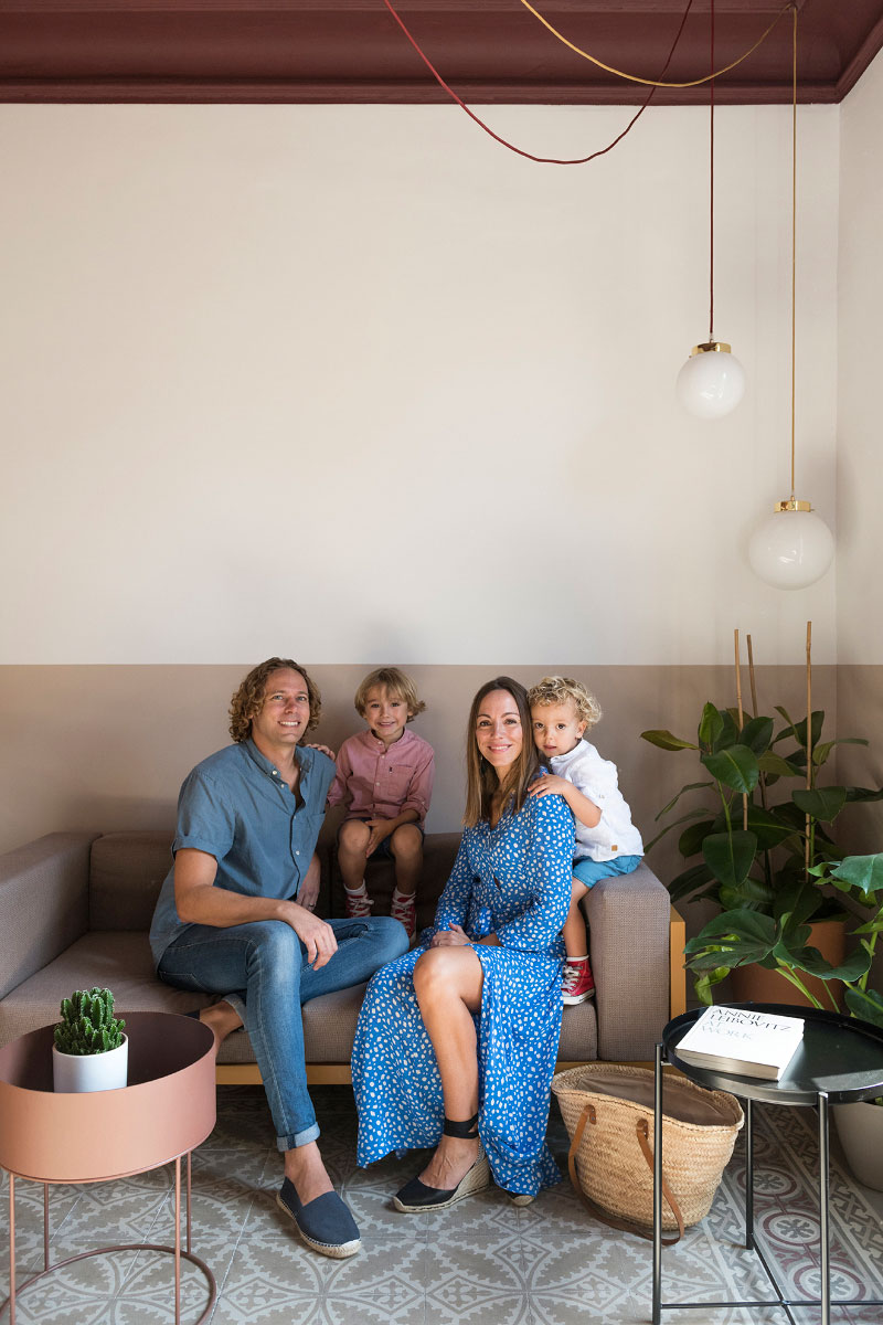
И красивая семья,жизнерадостная и позитивная,без комплексов советского прошлого
Спасибо за коммент)
Мне очень нравится, такие интересные сочетания и решения. Современность, но при этом чувствуются испанские нотки, благодаря цвету и декоративным елементам. Очень интересное сочетание
Потолки вообще огонь❤️
Нда, оказывается, мы в Союзе много лет назад предвосхитили современную интерьерную моду))))У наших людей в возрасте все это скорее вызывает негативные ассоциации с нищетой и казенностью
…